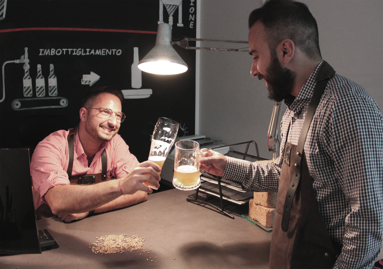
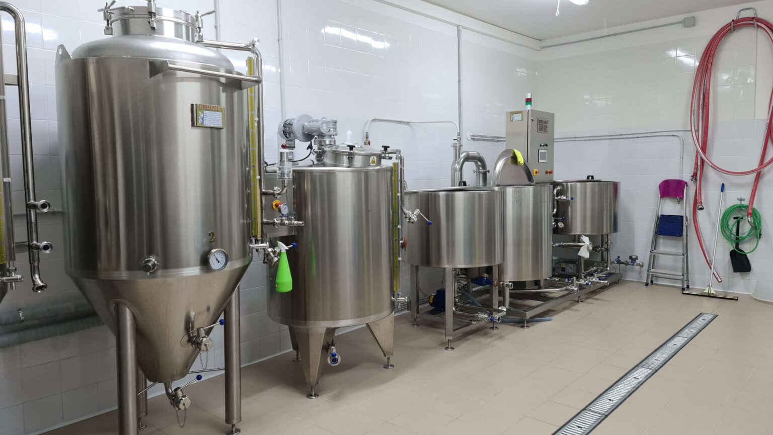
Beer has united peoples and people for centuries and we Calabrians have always had a strong sense of community. It is precisely the passion for beer and the love for our land that push us to bring together the best artisans and artists of the area, young people who have chosen to stay or return, to restore value to an ancient and still luxuriant, full region. of talented men and women, like so many centuries ago. For this reason, we have decided to give life to a project that enhances our places, choosing to focus on a 100% handmade product , from the production of the beer to the label, for which we worked together with a young local artist. Every detail is designed to contain meanings that tell about our land and the determination of our people.
The beer that enhances the territory
who we are
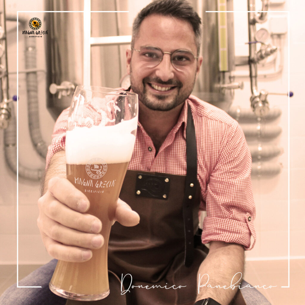
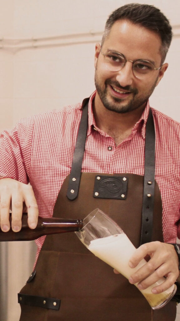
domenico panebianco
Madly in love with nature, its scents and colors. I compare myself to the enzyme used in beers: ALPHA-AMYLASE. The only difference is that the enzyme degrades starch to form complex sugars, while in my complex life there are only love stories.
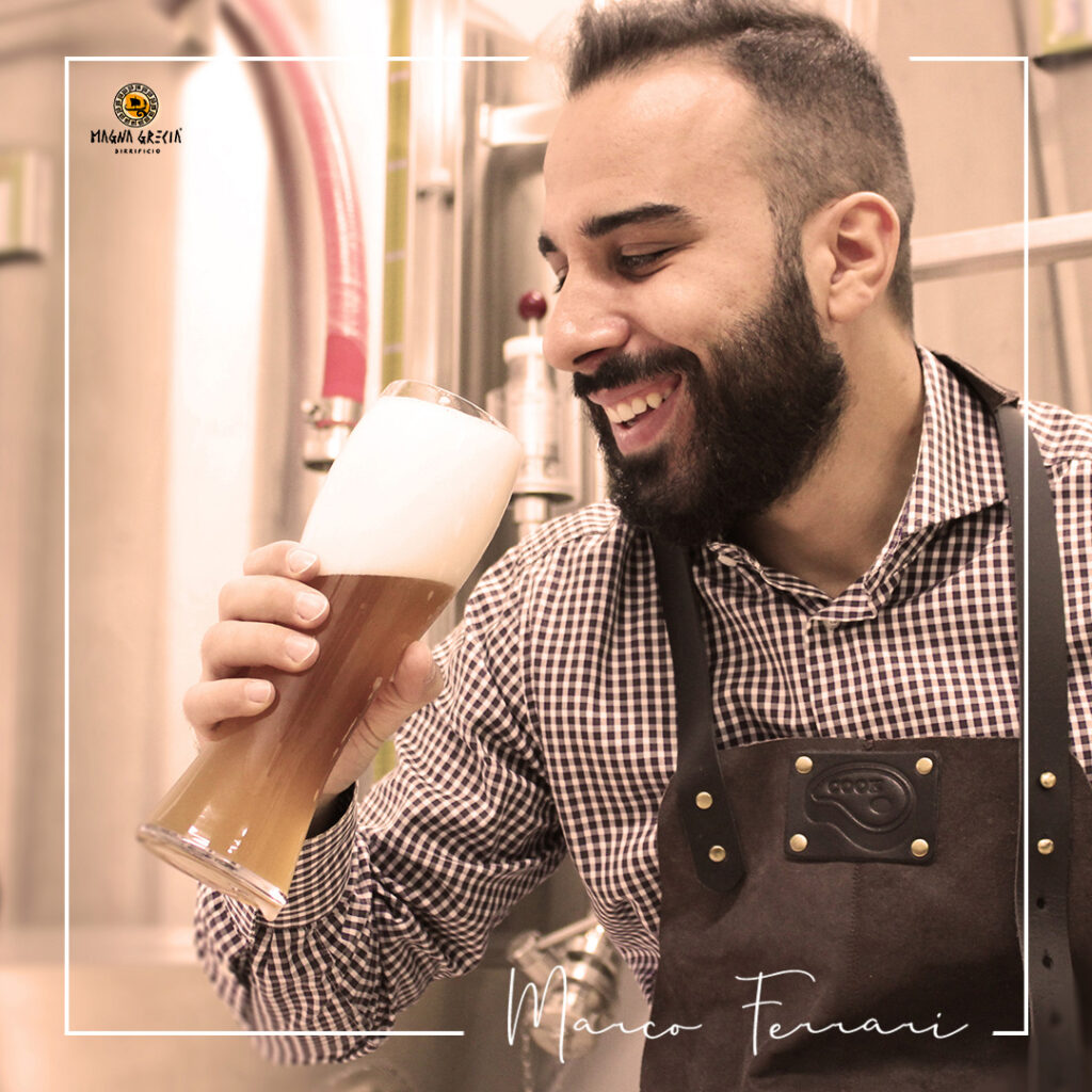
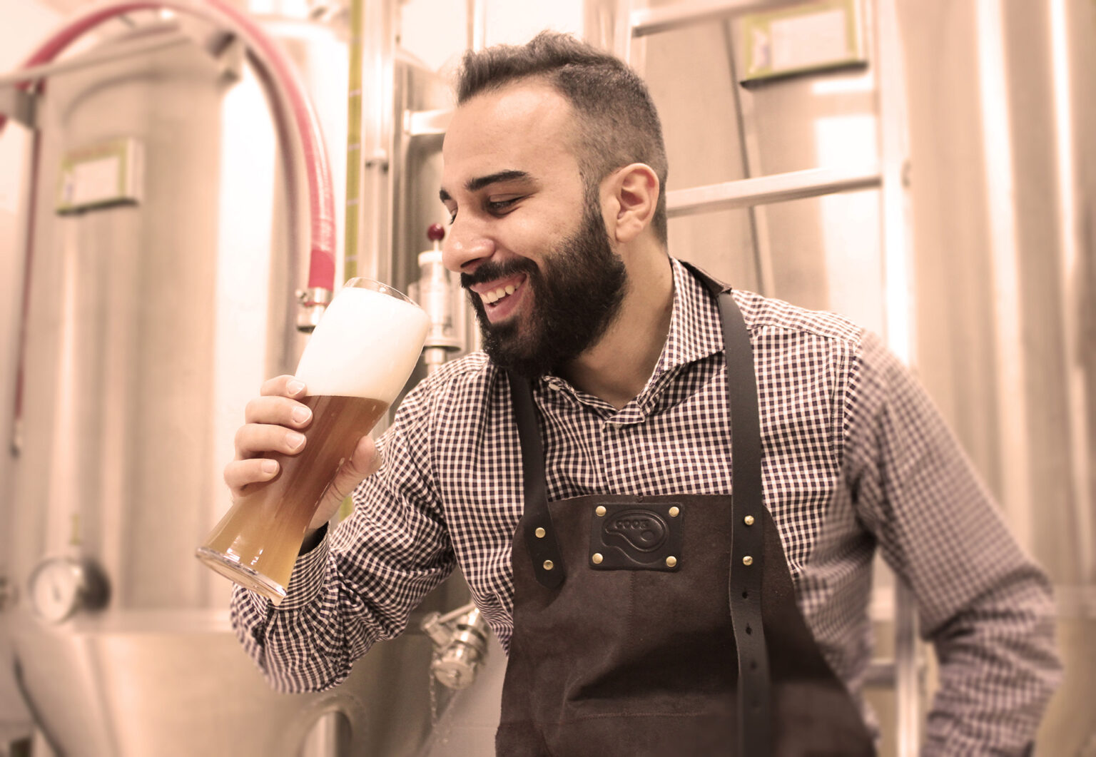
MARCO FERRARI
Doctor, traveler and passionate taster. During the realization of this project I learned that even beer requires study, patience and care and is an excellent medicine for the soul and for the body, in the right quantities. But above all, I realized that every beer tells someone! Tell me what beer you drink and I’ll tell you who you are.
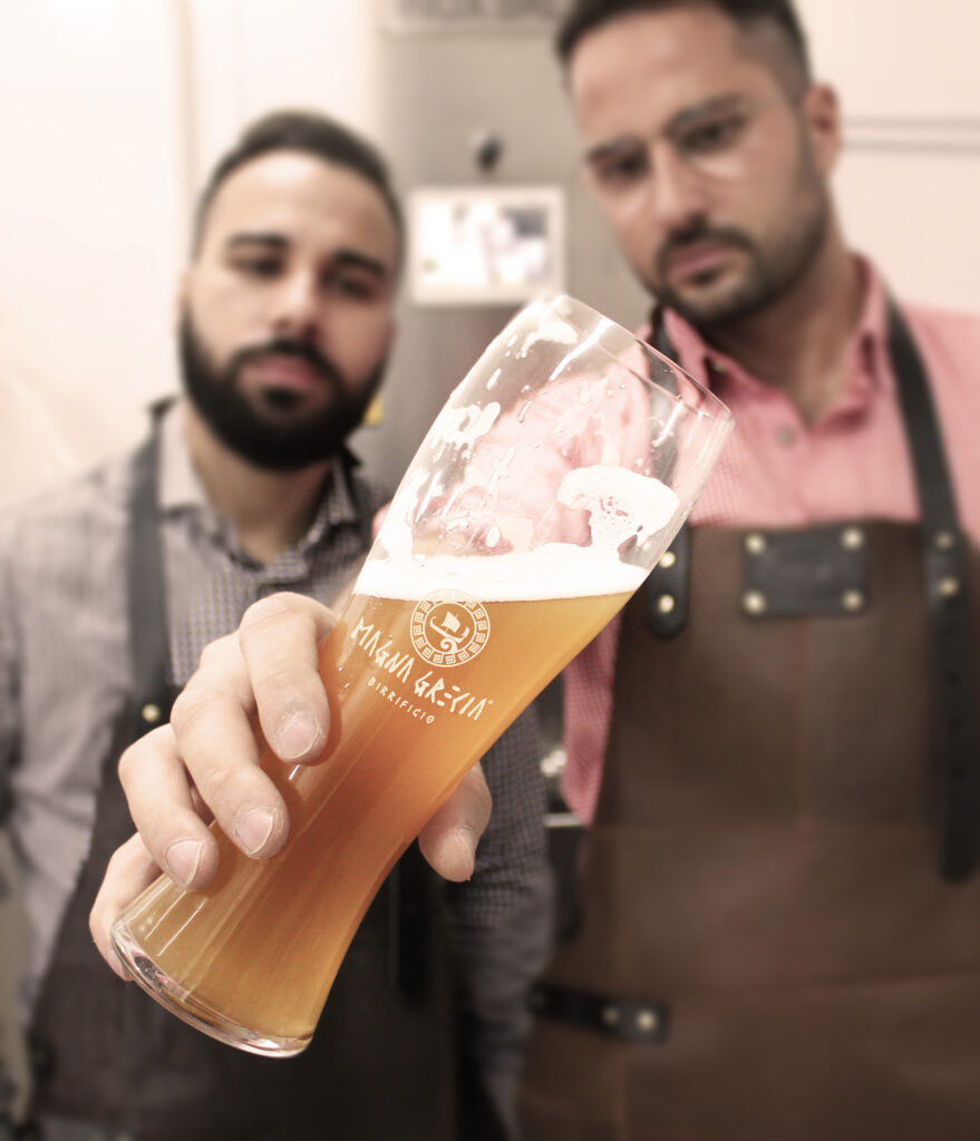
A work of art in a bottle
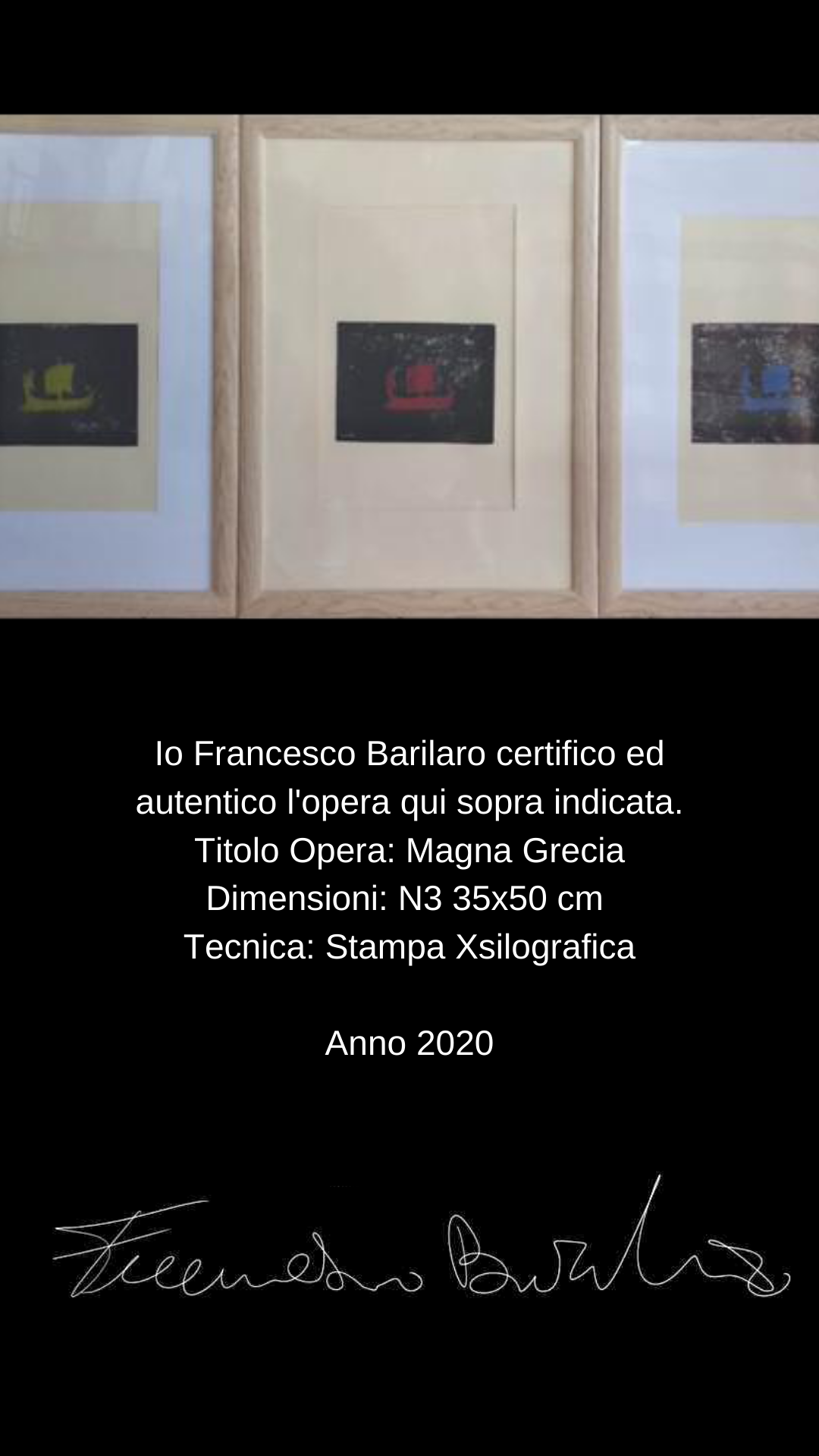
I Francesco Barilaro certify and authenticate the work indicated above.
Work title: Magna Grecia
Dimensions: N3 35×50 cm Technique: Xsilographic print
Year 2020
Art and Philosophy
Proud of our origins and proud of our Hellenic culture, we have decided to create a unique label able to visually bring us back to golden age of ancient Magna Graecia. This is why we have chosen a work of art as a symbol of our prodigious reality. The font of the Magna Graecia lettering, specially designed by hand, represents the originality of the beer that will be produced. The color is a shade of red with black strokes: the main colors of the Attic Greek vases, which actually derive from the same paint because the material used, rich in ferric oxide, red, baked in the absence of oxygen was transformed into black colour. This transformation is the process we carry out starting from the union of water, of malt , of the hops , and gods yeasts and the various possible shades of colors represent well the different types of beers produced, each with its own color. The set of symbols, rendered through the graphic arrangement of the elements, represents beer and a craft activity, with a strong link with the territory and the propensity to trade. The same that prompted the first Hellenic navigators to sail the sea in search of fertile lands and new routes for trade.
Beer has united peoples and people for centuries and we Calabrians have always had a strong sense of community. It is right there passion for beer and love for our land that push us to bring together the best artisans and artists of the area, young people who have chosen to stay or return, to restore value to a ancient region and still lush, full of talented men and women, like so many centuries ago.
We have decided to give life to a project that enhances our places, choosing to focus on a 100% handmade product and Calabrian , from the production of beer itself, to the label, for which we worked together with a young local artist. Every detail is designed to contain meanings that tell about our land and the determination of our people.
The beer that enhances the territory
who we are
domenico White bread
Madly in love with nature, its scents and colors. I compare myself to the enzyme used in beers: ALPHA-AMYLASE. The only difference is that the enzyme degrades starch to form complex sugars, while in my complex life there are only love stories
marco ferrari
Doctor, traveler and passionate taster. During the realization of this project I learned that even beer requires study, patience and care and is an excellent medicine for the soul and for the body, in the right quantities. But above all, I realized that every beer tells someone! Tell me what beer you drink and I’ll tell you who you are.
A work of art in a bottle
Art and Philosophy
Proud of our origins and proud of our Hellenic culture, we have decided to create a unique label able to visually bring us back to golden age of ancient Magna Graecia. This is why we have chosen a work of art as a symbol of our prodigious reality.
The font of the writing Magna Grecia , specially designed by hand, represents the originality of craft beer that will be produced. The color is a shade of red with black strokes: the main colors of Attic Greek vases. The set of symbols, rendered through the graphic arrangement of the elements, represents beer and acraft activity, with a strong link with the territory and the propensity to trade, the same that pushed the first Hellenic navigators to sail the sea in search of fertile lands and new routes for trade.
Utilizziamo i cookie per essere sicuri che tu possa avere la migliore esperienza sul nostro sito. Se continui ad utilizzare questo sito noi assumiamo che tu ne sia felice.OkNoPolitica dei Cookie